Why Small Businesses Need Formal Brand Guidelines
Many growing companies treat brand guidelines as a luxury reserved for global corporations. In reality, growing businesses face higher fragmentation risks because multiple people handle communications: freelance designers, in-house team members, social media managers, and web developers. Without a single source of truth, visual assets drift apart quickly.
When you know how to build brand guidelines for small business operations, you create structural guardrails that save hours of revision cycles. Whether you are launching fresh campaigns via custom websites or planning a broader identity refresh, clear standards prevent costly inconsistencies. Building a disciplined small business brand style guide ensures that any external contractor can pick up your creative files and generate collateral that looks exactly like your brand. If you are reviewing a full overhaul, exploring how much rebranding costs small business owners can help you contextualize where style documentation fits into the process.
Establishing systematic documentation also preserves internal efficiency. Instead of answering recurring questions about logo placement, correct color values, or heading font sizes, your leadership team can direct contractors to a centralized reference handbook. This single source of truth minimizes project bottlenecks, guarantees visual coherence across multi-channel campaigns, and eliminates guesswork for writers, illustrators, and developers.
The Core Elements of Small Business Style Guides
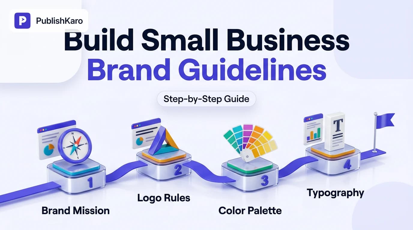
Every functional manual that aims to create brand identity guidelines covers foundational elements: brand foundation, visual rules, digital applications, and voice standards. Focusing on these core sections keeps the reference document clear and practical for everyday commercial use.
1. Brand Core: Mission, Vision, and Values
Before establishing visual parameters, outline why your business exists and how it communicates. Summarize your brand essence in three concise sections:
- Mission Statement: What practical value do you deliver, to whom, and how? Keep this to two clear sentences that define your day-to-day commitment to customers.
- Core Values: Three to five non-negotiable standards that govern customer interactions, product delivery, and internal decision-making.
- Audience Persona: A brief snapshot of your primary buyer's practical expectations, professional challenges, and visual preferences.
Providing this context prevents design decisions from becoming arbitrary aesthetic debates. When team members understand your target audience and mission, choosing between a playful design approach or an understated corporate layout becomes straightforward.
2. Logo Specifications and Clear Space
Your logo is your most recognizable asset. Specify its core variants and technical rules:
- Primary Lockup: The standard orientation for full-width headers and official documents.
- Secondary/Stacked Lockup: Vertical versions designed for square formats and social profile pictures.
- Monochrome & Reverse Options: Solid white and solid black variations for dark backgrounds or single-color physical printing.
- Clear Space: Define margin rules using a component of the logo (for example, "the height of the letter X") to ensure margins around your mark remain uncluttered by neighboring text or page borders.
- Minimum Sizing: State minimum pixel and millimeter thresholds below which the logo loses legibility in print or on mobile displays.
- Misuse Rules: Include visual examples showing what never to do, such as stretching proportions, applying drop shadows, rotating the mark, or swapping colors.
3. Color Palette Architecture
A solid brand palette balances personality with digital accessibility. Specify:
- Primary Colors: One or two brand colors used for main recognition across navigation bars, packaging, and hero graphics.
- Secondary & Accent Colors: Tones used sparingly for buttons, links, banners, and callout boxes to drive user attention.
- Neutral Palette: Specific grays, off-whites, and dark tones for body text, card backgrounds, and subtle dividers.
- Code Formats: List HEX (web), RGB (screens), and CMYK (print) values for each shade so printing vendors and digital creators achieve identical results.
Ensure digital text-to-background combinations meet web contrast standards outlined in the WCAG Accessibility Guidelines. Adequate contrast ensures text remains readable for all users across screens.
4. Typography Hierarchy
Document primary and secondary typefaces along with their digital fallbacks to guarantee predictable typographic rendering across diverse devices:
- Headings (H1, H2, H3): Font family, specific weights (such as Bold 700), line height, and capitalization conventions.
- Body Text: Font family, base size (such as 16px), line height (typically 1.5 to 1.6 times the font size), and standard weight (Regular 400).
- Web Safe System Fallbacks: Specify standard fonts (such as Arial, Helvetica, or system-ui) so browser rendering remains consistent if custom web fonts fail to load or experience network latency.
Maintaining clean typographic rules supports visual stability across platforms, preventing layout shifts during page load that impact layout metrics described in Google's Core Web Vitals.
5. Tone of Voice and Editorial Rules
Brand consistency extends beyond graphics into copy. Provide rules covering:
- Perspective: Do you write in first-person plural ("we"), third person, or direct second person ("you")?
- Tone Characteristics: Pair descriptive traits with boundaries (for example, "Confident, but never arrogant; informative, but never academic").
- Terminology and Jargon: Define preferred phrasing for key services and list banned industry buzzwords your team must avoid.
- Formatting Conventions: Establish guidelines for punctuation, bullet point usage, title casing versus sentence casing in headlines, and date structures.
Practical Examples
Example 1: Local Service Firm (B2B Consulting)
- Palette: Deep Navy (
#0F172A), Slate Gray (#475569), Warm Amber accent (#D97706), Off-White (#F8FAFC). - Typography: Merriweather (Headings) paired with Inter (Body text).
- Voice Rule: Direct, analytical, objective. Use data-backed explanations without conversational slang or hyperbole.
- Application: Applied across technical case studies, clean proposals, client onboarding PDFs, and corporate presentations.
Example 2: Direct-to-Consumer Boutique Brand
- Palette: Terracotta (
#C25E43), Cream (#FFFBF5), Charcoal (#1F2421), Sage Green (#8A9A86). - Typography: Playfair Display (H1/H2) paired with DM Sans (Body/Buttons).
- Voice Rule: Welcoming, warm, sensory-driven. Address the customer directly in conversational second-person sentences.
- Application: Applied across packaging inserts, unboxing cards, automated email sequences, and storefronts built with Shopify stores.
Example 3: SaaS Productivity Platform
- Palette: Royal Indigo (
#4338CA), Mint Teal (#0D9488), Crisp White (#FFFFFF), Zinc Neutral (#27272A). - Typography: Plus Jakarta Sans (Headings) paired with Roboto (Body text).
- Voice Rule: Pragmatic, empowering, concise. Focus on time saved and streamlined execution; eliminate passive voice entirely.
- Application: Applied across product feature releases, user interface tooltips, knowledge base tutorials, and transactional emails.
Step-by-Step: Rolling Out Your Brand Guidelines
Step 1: Inventory Your Existing Brand Assets
Audit your existing presence. Collect active brochures, social media graphics, invoices, pitch decks, and website pages. Group them into a folder to identify discrepancies in logo versions, font weights, and color shades. Make note of legacy logos, outdated taglines, and unauthorized font variants that have crept into day-to-day operations over time.
Step 2: Establish the Core Guidelines Document
Draft the initial manual using accessible tools like Figma, Google Docs, or Canva. A functional small business guide does not need to span 80 pages; a focused 8- to 12-page manual covering logo rules, palette values, fonts, image direction, and tone is immediately usable by third-party teams.
If you work with creative partners through comprehensive design and branding services, request both an editable vector file and a shareable PDF version for ongoing distribution. At PublishKaro, projects are quoted after a free call, at a fixed price agreed in writing, ensuring complete clarity on deliverables before design work begins.
Step 3: Align Digital and Physical Profiles
Apply updated standards across digital touchpoints to reinforce consistency:
- Audit your website headers, typography classes, metadata, and landing pages on WordPress sites.
- Review digital commerce touchpoints if you manage multi-region storefronts, referencing guides on setting up Shopify Markets multi-currency to ensure regional currencies retain standard typography.
- Configure email templates cleanly, aligning domain credentials as detailed in our guide on how to set up branded sending domain Klaviyo records to preserve sender trust.
- Update business profiles and directories according to official Google Business Profile guidelines.
- Refresh profile images, banners, and description copy across social networks such as LinkedIn, YouTube, and Instagram.
Step 4: Streamline Team Workflows
Store your finalized brand assets—SVG logos, font packages, and brand sheets—in a shared cloud drive accessible to all internal staff and freelance contractors. Organize the folder structure clearly (e.g., /Logos/Vector/, /Logos/PNG/, /Fonts/, /Brand_Guidelines_PDF/).
To keep external communications on-brand without manual oversight, pair your guidelines with modern publishing infrastructure. For social media management, the PublishKaro publishing app allows teams to draft social posts in Google Sheets, apply custom prompts to generate on-brand captions, run automated spell-checks on both captions and embedded media text, and publish directly to social networks via official APIs.
Step 5: Enforce and Audit Brand Guidelines Regularly
Publishing guidelines is only the beginning; ongoing adherence requires regular review. Schedule a bi-monthly audit where your marketing lead reviews live web pages, ad creatives, and recent social updates against your master brand manual. When team members submit assets with unapproved hex codes or distorted logos, provide constructive feedback by pointing to the exact page in the brand style guide.
Comparison Table
| Document Type | Length | Target Audience | Primary Focus Areas | Update Frequency |
|---|---|---|---|---|
| Quick Brand Cheat Sheet | 1 Page | External copywriters, ad designers, printers | Hex codes, logo files, font names, one-sentence mission | Biannual |
| Core Small Business Guide | 6–12 Pages | Marketing contractors, web developers, internal team | Logo variations, hierarchy, voice rules, image styles, contrast | Annual |
| Enterprise Brand Book | 40+ Pages | Global agency networks, legal teams, regional offices | Architecture, sub-brands, complex legal requirements, packaging | Every 2–3 years |
Visual guide
Five Steps to Roll Out Guidelines
Follow this phased sequence to audit existing brand collateral, document your core standards, and keep external contributors aligned.
Core Elements of Brand Guidelines
These four foundational building blocks combine to create a reliable single source of truth for your business.
Reviewing Creative Submissions for Compliance
Use this decision framework during routine audits to catch unapproved design tweaks before assets go live.
Checklist
- Vector Logo Package Ready: Export master marks in SVG, high-res PNG (transparent background), and vector PDF formats.
- Color Codes Documented: Include HEX, RGB, and CMYK formats for all primary, secondary, and neutral shades.
- Contrast Verified: Test body and button text against backgrounds using WCAG-compliant contrast tools.
- Typography Specified: Document weights, line heights, and web fallbacks for H1 through H3 and body copy.
- Voice Guardrails Defined: Detail explicit "Do" and "Don't" examples for customer-facing copy.
- Imagery Standards Outlined: Specify preferred photography lighting, composition style, and acceptable icon sets.
- Asset Library Centralized: Save approved assets in an organized cloud storage folder with read-only access for partners.
- Digital Templates Updated: Apply typography and colors across email systems, social templates, and marketing campaigns.
Connecting Guidelines to Marketing Execution
A brand style guide is only useful when applied consistently. Once documented, enforce your visual and editorial standards across ongoing marketing channels, including targeted ads management and content creation. Review performance and technical foundations systematically by consulting Google's SEO Starter Guide and aligning technical elements on custom websites.
If you produce dynamic video campaigns or social media creative, consistent typography and colors make your content immediately recognizable. PublishKaro offers published video rates for standard production: Motion graphics reels: ₹2,000–₹5,000 per 1-minute video; Animated-film style 3D: ₹4,000–₹10,000 per 1-minute video; Video editing for every feed: ₹1,000–₹5,000 per 1-minute video; AI video: ₹3,000–₹10,000 per 1-minute video. For custom web design, strategy, and full branding systems, projects are quoted after a free call, at a fixed price agreed in writing.
For more branding workflows, design best practices, and marketing tutorials, browse the full PublishKaro blog or dive into our dedicated design articles.
Key Takeaways
- Small business brand guidelines prevent visual fragmentation across distributed freelancers, internal teams, and web channels.
- Focus your guide on five core pillars: brand foundations, logo usage, color palette, typography hierarchy, and tone of voice.
- Ensure color combinations meet web accessibility criteria to provide clear readability on all devices.
- Keep your document concise—between 6 and 12 pages—so creative partners can review and implement rules quickly.
- Store vector logos, font files, and PDF guidelines in a centralized cloud folder to streamline hand-offs.
- Conduct bi-monthly audits to keep marketing collateral aligned with documented standards as your business scales.
Frequently asked questions
How long should small business brand guidelines be?
A practical small business brand guide should be 5 to 12 pages. This provides enough room to document logos, colors, fonts, voice guidelines, and visual examples without overwhelming team members and contractors.
What file formats should be included in brand assets?
Include vector formats like SVG and EPS for print and web scaling, alongside transparent high-resolution PNG files for general office documents and presentations. Retain master vector source files in AI or Figma formats.
How often should brand guidelines be updated?
Review your guidelines once a year to address new design requirements, such as emerging social media aspect ratios or updated web templates. Core elements like logos and foundational colors should remain stable for several years.
What is the difference between a brand book and brand guidelines?
Brand guidelines provide practical technical rules for using logos, colors, fonts, and tone across daily marketing assets. A brand book is a broader, narrative-focused document that explores company history, brand philosophy, and emotional storytelling.
Do small businesses need separate guidelines for social media?
Small businesses do not need a separate manual, but they should include a dedicated section for social channels. This section should cover profile image lockups, post dimensions, thumbnail typography, and comment response tone.
Can I create brand guidelines using free tools?
Yes. Small business teams can assemble clear, functional brand manuals using tools like Google Docs, Google Slides, or Canva. The key is organizing the technical values clearly (HEX codes, clear space, font names) so partners can find what they need in seconds.
Who should have access to our company brand style guide?
Keep the master guide and asset repository accessible to internal marketing staff, customer support leads, web developers, and external creative freelancers. Providing read-only cloud folder access ensures partners always download authorized, up-to-date assets.